Context
I sat in with sim racers across a wide range of skill bands, from sub-2000 ranked players up to professional league drivers, to understand when in a lap a driver actually has any attention to spare. In practice, that turned out to be almost never through the corner itself, sometimes on the straight, and only properly on the cool-down lap.
Problem
Drivers struggled to tell which fundamentals were actually costing them lap time, where they were being inconsistent, or whether they were simply overdriving the car. Traditional telemetry was dense, arrived too late, and was effectively impossible to act on mid-session. Anything that lived on screen also had to be described as genuinely non-distracting by drivers themselves, which turned out to be the biggest single factor in adoption and took several rounds of testing to get right.
My role
Lead Product Designer on RTSA. I partnered with PMs, engineers, and a motorsport coaching SME to shape the real-time telemetry experience, ran user interviews and on-rig observation with drivers across skill levels, and led the usability testing focused on readability and driver focus. A lot of the work was about balancing information density against cognitive load at race pace, while making sure the feature was substantial enough to sit in the premium tier without feeling like a paywalled gimmick.
Goals
- G1Design an unobtrusive interface that quietly communicates performance feedback while the driver is mid-corner, instead of competing for their attention.
- G2Make the microinteractions, motion, and colour-graded feedback feel responsive and considered, so the system reads as a premium part of the product.
- G3Keep every telemetry insight readable during high-speed cornering, even when track conditions are changing quickly.
Process
- 01
Research and driver interviews
I sat in with sim racers across a wide range of skill bands, from sub-2000 ranked players up to professional league drivers, to understand when in a lap a driver actually has any attention to spare. In practice, that turned out to be almost never through the corner itself, occasionally on the straight, and only fully on the cool-down lap.
- 02
Telemetry analysis
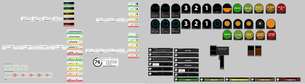
I worked with engineering to inventory every signal the platform was capturing, then ranked them by how coachable they actually were. The shortlist became the foundation for RTSA's modules, covering gear at apex, brake timing, corner entry speed, throttle smoothness, racing-line consistency, trail-braking score, and exit-speed optimisation.
- 03
Hypothesis and skill mapping
I co-designed the skill taxonomy with a motorsport coaching SME so each module mapped to an actual driving fundamental instead of a number that looked impressive. Every skill also got a clear definition of what 'wrong' looked like, which gave the grading rubric something real to lean on.
- 04
Information architecture
RTSA was designed as a system of small, single-purpose modules that drivers can opt in or out of. Each module is independently positionable in the HUD, so a driver can build a layout that suits their car, their view, and whatever discipline they happen to be racing in.
- 05
UI exploration and motion studies
I explored the colour-grading language across dozens of variants, including bars, pills, rings, and segmented gauges, and tested how each one actually read at speed. We eventually settled on a horizontal segmented track with a soft glow on grade transitions, because it was quiet enough to ignore when needed, although still sharp enough to catch in peripheral vision.
- 06
Prototype testing
We tested on real rigs at racing speed using a kind of informal eye-tracking observation. Any variant that demanded a fixation was cut. Anything a driver could read at a glance was kept and refined further.
- 07
Engineering collaboration
A lot of the work involved designing around the realities of telemetry latency and frame budgets, because the grade you see at the apex has to reflect the apex you just drove, not the one before it.
- 08
Iteration and validation
We shipped to paid-tier users in waves, instrumented HUD-glance frequency, and iterated on module sizing, colour thresholds, and animation timings until the grades stopped being second-guessed.
Key design decisions
Decision 01
Colour before number
Drivers can parse a colour in peripheral vision, while reading a number requires a fixation. Each module leads with a simple red, yellow, or green grade, and only reveals the underlying value during review.
Decision 02
Designed to disappear
Because 'not distracting' was the real bar for adoption, several iterations were spent quietly removing weight, motion, and density. Drivers eventually stopped noticing RTSA was on screen, which is the point at which they started trusting it.
Decision 03
Passive, never prescriptive
RTSA grades, it does not instruct. There are no mid-corner prompts, because the goal is to keep the driver in flow and let them self-correct on the next lap.
Early iterations
Exploring how to grade a corner
Earlier RTSA concepts leaned heavily on numeric scores, ring meters, and dense status copy. Those looked precise on paper, although they were hard to read at speed. Each round of user testing pushed the system toward something simpler that drivers could actually parse mid-lap.
“It’s too hard to determine how much I missed the target by. The colours are interesting but the number grade doesn’t tell me anything.”
That feedback reframed the brief. It suggested we should stop asking drivers to decode a score and instead show them, on a single axis, which side of optimal they had landed on. That insight is what eventually led to the final left-to-right scale with a centre green zone.
Feature showcase
All skills
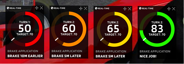
Brake Points
User flow
Step 1
Driver launches a session and RTSA quietly calibrates to the car and track.
Step 2
During the lap, colour-graded modules update on a corner-by-corner basis in the HUD.
Step 3
After the session, the full skill breakdown is available to review against telemetry.
Outcome / impact
“Having Mansell on there helps reinforce good habits…and Real-Time gives you a level of assurance [of proper technique].”
Reflection
RTSA grades passively, pairing a colour with a single short line of text. That choice was deliberate, because it lets the driver stay in flow and self-correct on the next lap instead of having to read or react to the interface in the moment.
Next project
Telemetry Overlays